Primary Navigation Redesign

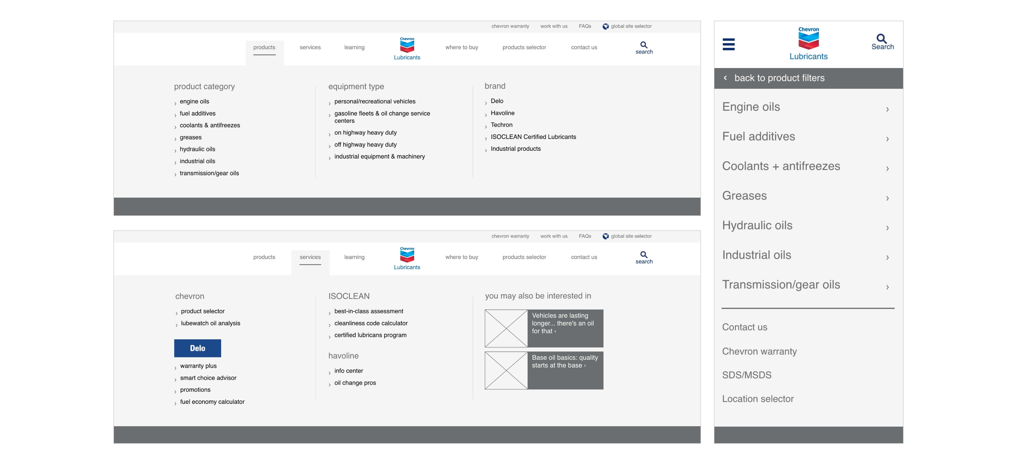
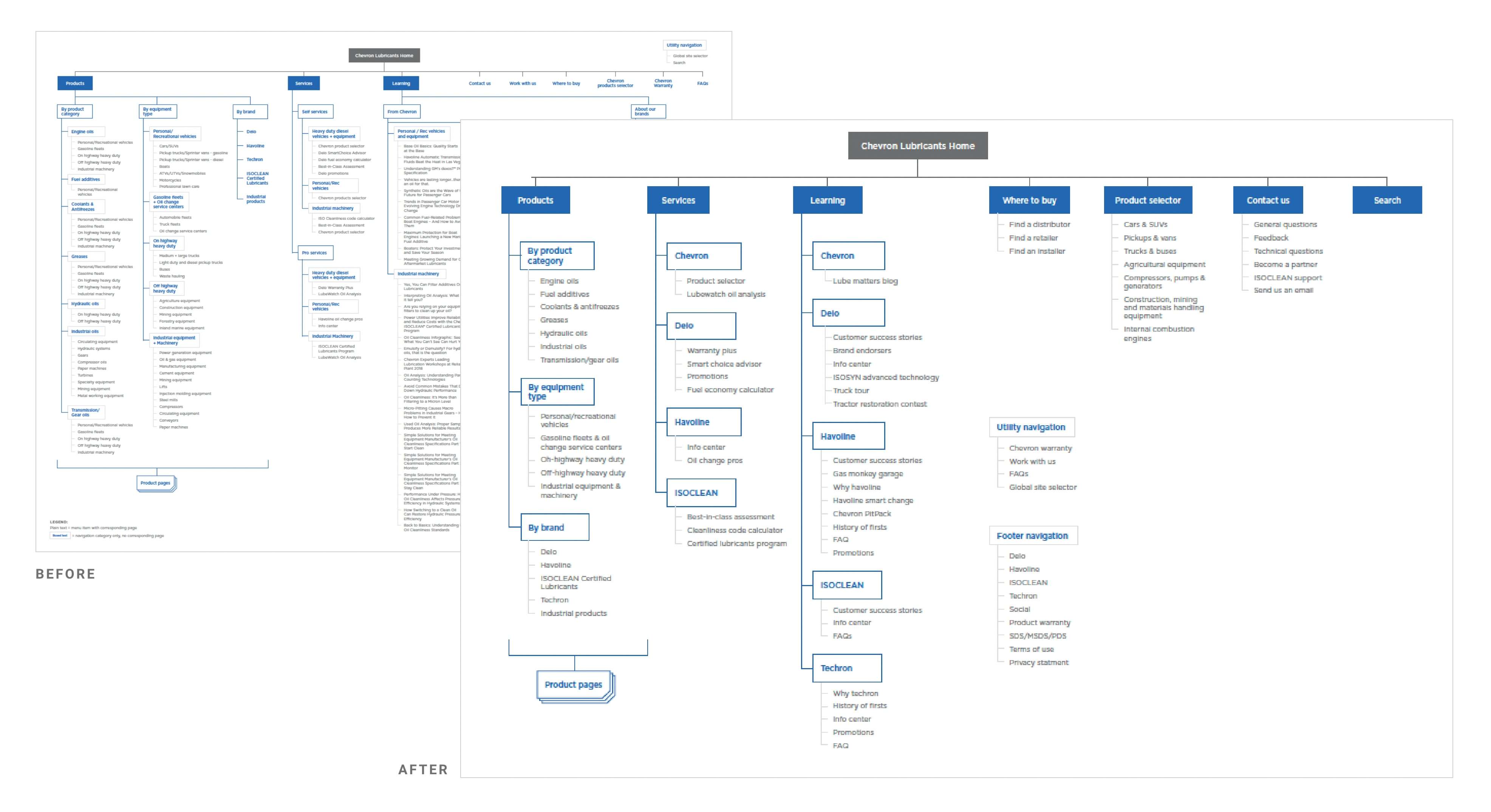
Chevron's primary navigation went against all UX best practices. They knew it was difficult for their users but didn't know how to fix it. After performing a UX audit, I found that in addition to basic usability practices not being followed, the primary difficulty was in the overwhelming amount of information available to choose from. If a user can't find what they're looking for or perceive the experience as too complex, they'll find another site that's easier, meaning that Chevron was actively losing prospects because of their menu design. And that's where the problem-solving began: simplifying the information architecture that informs the primary navigation.

UX Designer
UI Designer

Designed at Quarry

Driving users away

When a user engages with the navigation of a website, they begin to build a mental model of the way the site is organized. The more choices they have increases their perception of how difficult it will be for them to understand how the site is structured and how difficult it will be to find what they’re looking for. When users perceive that achieving their goals will be difficult, they leave and find an easier website to navigate. At the same time, there needs be enough information for them to understand what will be available to them on the site. It's a fine balance.

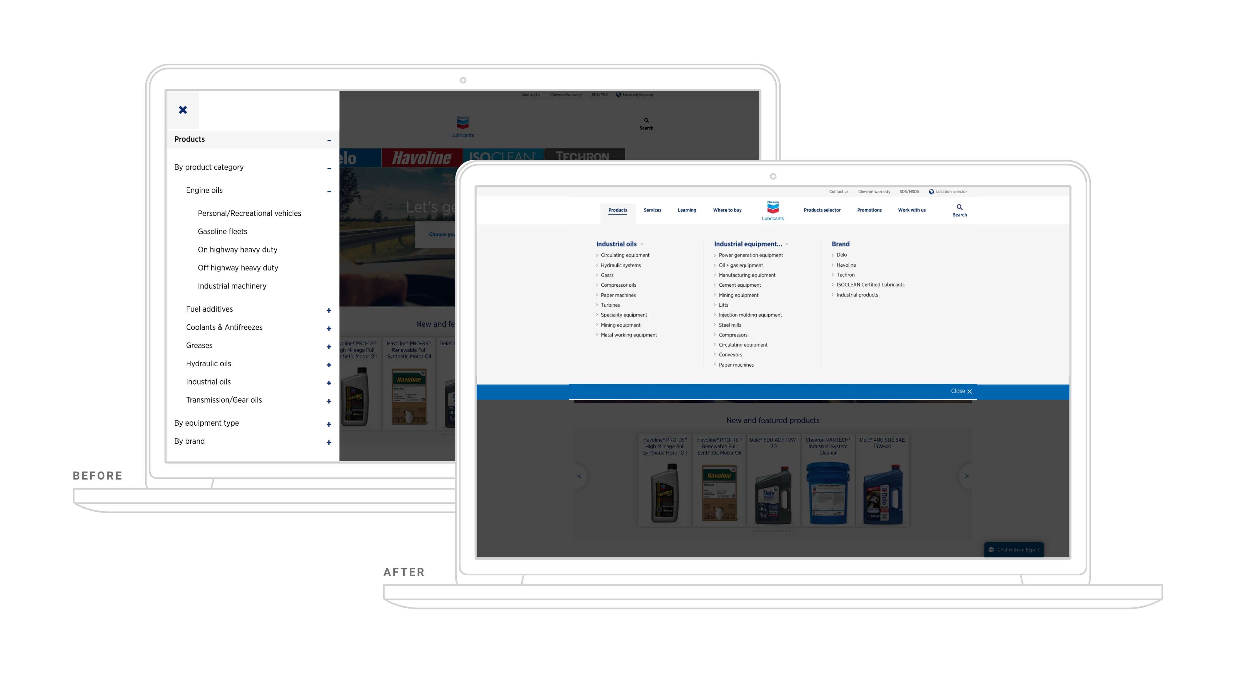
Chevron's original navigation solution contained four layers of information, 83 links in one dropdown alone, inconsistent heading designs, duplicate links, and an left-hand-side menu, all hidden behind a hamburger icon on tablet and desktop devices that reduced discoverability.
Main solution recommendations

Outcome

The redesign of Chevron's menu not only improved the user experience, but also had an added bonus of easy maintenance for the Chevron team. A new, well-designed menu keeps prospects and customers on their site longer, helping users to find what they need while simultaneously ensuring Chevron isn't removed from their vendor list because of an unusable website. Results:

  • In one dropdown alone, the new design and organization reduced clickable elements from 83 down to 17
  • Eliminated duplicate links
  • Reduced the amount of interactions a user must take to reach their goal from 6 steps to 2

People-First
Website Design

Graebel came to us with the desire to update its flagship website to better reflect their strong global position in the industry and signal the exceptional experiences Graebel provides its client and their assignees worldwide everyday.

Website strategy and design

View

Calculating Freezepoints
in the Field

The Freezepoint Calculator helps vehicle operators understand when coolant maintenance is required by performing complex calculations in an easy-to-use interface.

Digital tool

View

Reducing Barriers
in a Contact Form

With UX best practices and marketing requirements at odds, Windstream Enterprise's new contact form design ensures that the form itself is not contributing to abandonment.

Contact form experience

View

Chevron Navigation Redesign

If a user can't find what they're looking for or perceive the experience as too complex, they'll find another site that's easier, meaning that Chevron was actively losing prospects because of their menu design. And that's where the problem-solving began: simplifying the information architecture that informs the primary navigation.

Navigation UX design

View

Nature informs the
triple bottom line

Learning from nature was the key to building a sustainability roadmap for Quarry.

Biomimicry investigation

View

eQo Green
Team

As Quarry's Green Team Lead, this self-led role involved leading a lean team of Qmates dedicated to and passionate about environmental sustainability in the pursuit of educating employees and advancing Quarry's processes towards sustainability.

View

Welcome

I am Eve

I am a graphic designer and front-end web developer who specializes in branding and digital design. I am a life-long learner and my current pursuit is in Biomimicry and its applications for graphic design.

For the sake of focus.

My design mantra, "For the sake of focus" is derived from a longer quote, "Minimalism is not subtraction for the sake of subtraction. Minimalism is subtraction for the sake of focus." (-unknown) It's easy to design for the purpose of arbitrarily making content pretty. I design for the purpose of honouring content by using design to enhance the focus of the message.

Interested in hiring me?
Shoot me an email: eve@whillier.com

View Resume

Design Excellence in Typography

This Mars calendar series was featured in the Spring '15 gallery of design work and chosen by a panel of judges to receive an award in Design Excellence.

View

Design Excellence in Innovation Space

Working on a multidisciplinary team, we researched and ideated through proof of concept a drone capable of restoring communication infrastructure over an area where a natural disaster has taken out communication. Our work was chosen to receive an award in Design Excellence.

View

Design Excellence in Illustration

Drawn, painted and then illustrated, this glass complex object was featured in the Spring '15 gallery of design work and chosen by a panel of judges to receive an award in Design Excellence.

View

Design Excellence in Letterform

Sketched, painted, and illustrated from scratch, Utopian was featured in the Fall '14 gallery of design work and chosen by a panel of judges to receive an award in Design Excellence.

View