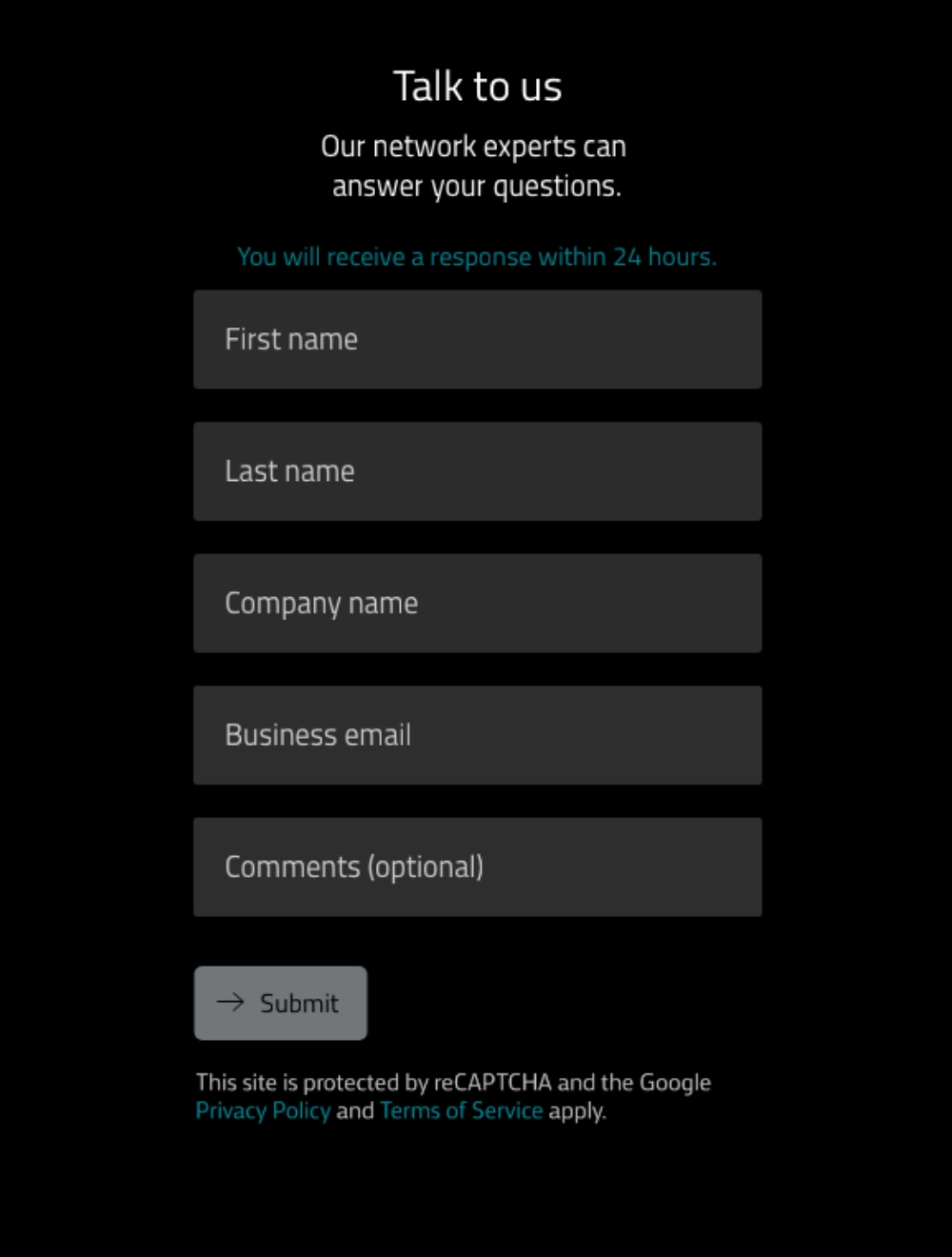
Aligning the form to match B2B user expectations
The new contact form experience provides succinct, scannable messaging, optimizes visuals to reduce perceived effort, and provides sufficient feedback to improve usability. In addition to table-stakes design guidelines like including placeholder text and labels above the fields, my high-level recommendations focused on ensuring the following experience that so many B2B organizations miss when designing their forms:
- Tell people when they can expect a response
- Ensure that the value of filling out the form is clear in order to encourage follow-through
- Ask for information that's relevant to the user's task, requiring only a minimum effort to acquire the perceived value
- Offer a contact form only in addition to email and telephone numbers, not as a replacement
- Ensure the user has something to do next
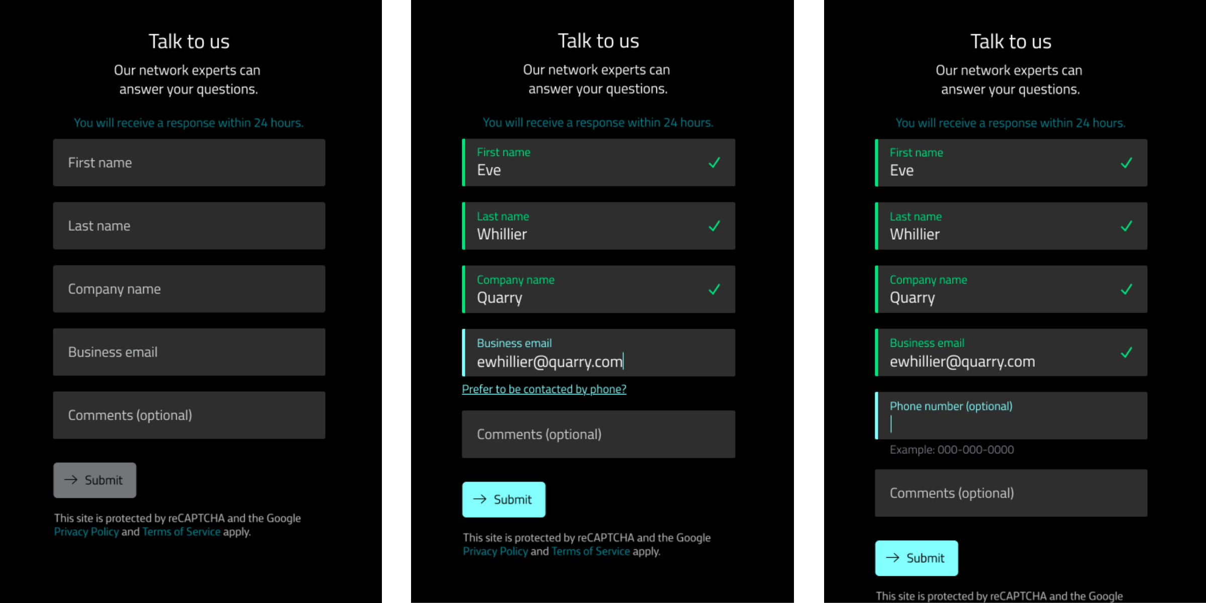
Progressively revealing optional fields
While combining first and last name fields was not an option in this case due to technological limitations, I designed a pattern for optional fields to be hidden when the user first sees the form, and pop up as prompts while their filling it out. In the case of the phone number, it is initially hidden, but once the user types in their email, a smooth animation enables a prompt below the field: "Prefer to be contacted by phone?" The user can click this prompt to reveal another field for the phone number. Approaching forms in this way reduces the perceived effort, shows the information in context, and relies on the Zeigarnik principle that compels people to complete a task they've already begun.
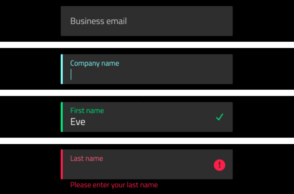
Ensuring form best practices are met
An initial review of WE's form revealed a number of best practices not being met. WE's new form included the following:
- A single column of fields
- Labels separate from placeholder text
- Inline validation states
- Inline error states
- Helper text when an error is detected
- Substantially different focus, complete, and error states that rely on more than just colour changes for people with differing visual abilities
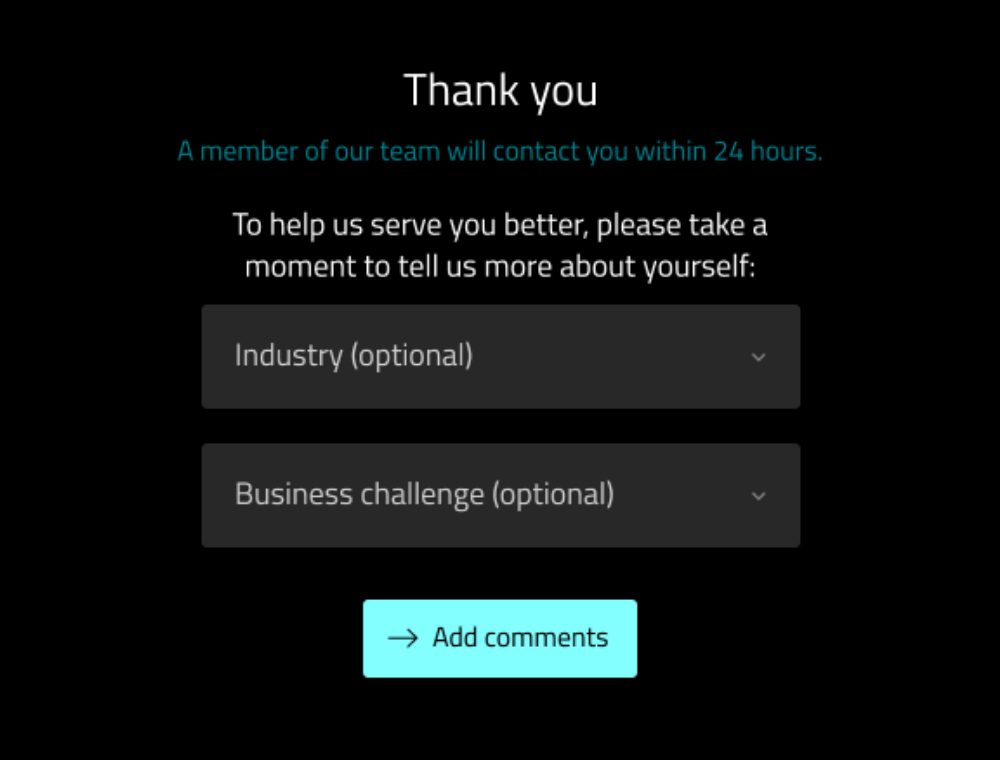
Appending a form submission with
a request for more information
Once the form has been submitted, WE's form experience takes the user to a thank you page that asks for more optional information that will help their sales agents better prepare for the conversation. By including these fields on a second page, WE is less likely to lose leads because of an overwhelming form, and more likely to gain extra information about a prospect because of the extra value it may bring the user.
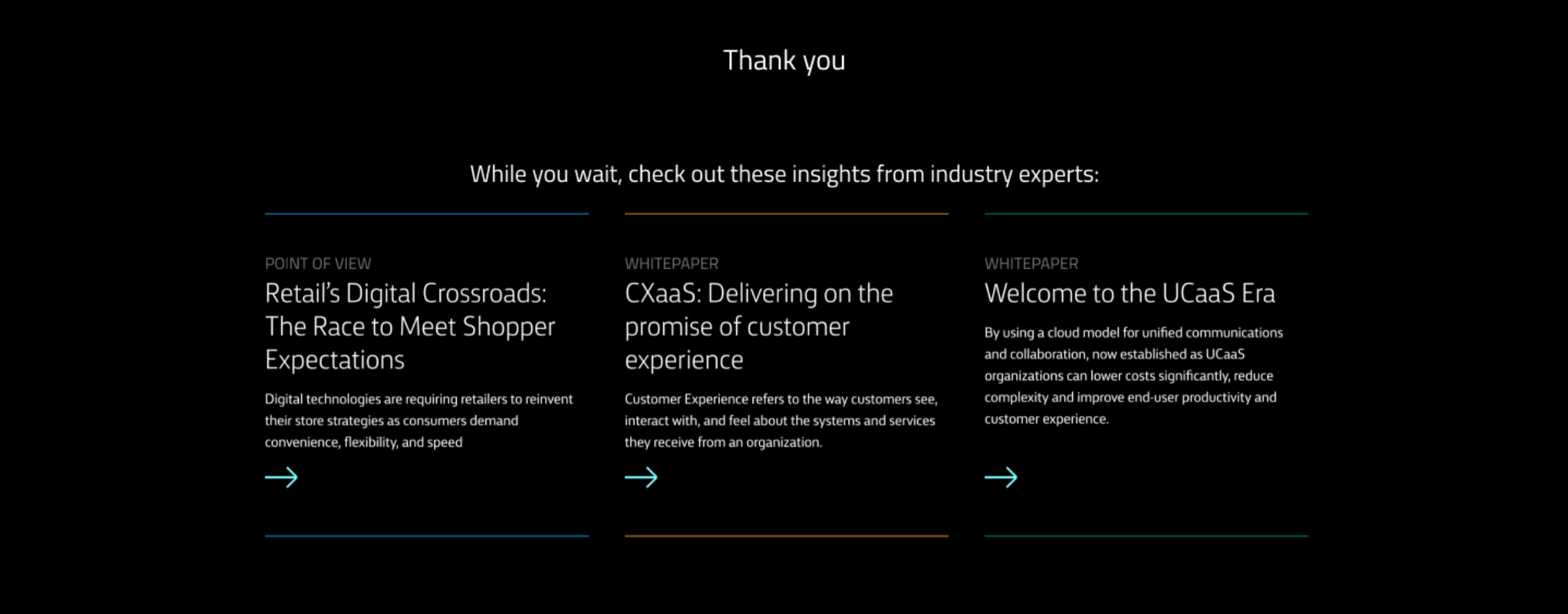
Giving the user something to do next
Once the user has filled out the form, multiple resources personalized to that user appear, allowing a continuous experience with WE's content should the user so choose.